
Android Data Recovery


As iOS 7 Beta 3 download version is released on July 8, iOS 7 has been available for more than one month. Have you experienced the new fantastic feelings iOS 7 brings to you?
iOS 7 is completely changed from what we are used to in Apple's designs. Debates and arguments are still on. The new Apple's rainbow logo and color scheme of iOS 7 are all thought to be garish as they are too candy-colored. What's the reason of such big change? Maybe we can get some answers from the recent reports by the media.
![]()
To data back, we can see the Apple logo has experienced the change from colorful designs to commercial black, and now, back to multi-color outlooks. The interface under iOS 7 is more vibrant, and the color scheme is made up of primary colors and flatter, with less gloss on it. So, the Apple's rainbow logo and color scheme of iOS 7 are actually inspired by the original Apple logo?
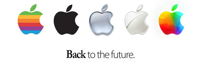
Take a look at the rainbow colors in the original classic logo and then look at the new iOS 7 logo, it seems that they indeed have similarities. Therefore, new changes of Apple logo will have unique effects on its future products undoubtedly. Apple's rainbow logo and color scheme of iOS 7 will be used in iPhone 5S. Apple lovers can enjoy the totally new interface it brings. Better or worse? It is all your taste.