Android Data Recovery
Have you upgrade iTunes 11 to iTunes 12 since the latest version release? iTunes 12 has been redesigned. Nevertheless, do you really know spotlights of the new version? Get a quick tour of iTunes 12 and learn how to organize and play your media, create playlists, listen to iTunes Radio, and more.
User Guide for iTunes 12 :
How to Sync Photos from iTunes 12 to iPhone
Differences between iTunes Sync and iTunes Backup
How to Sync Music, Movies, E-books to iPhone/iPad with iTunes 12
Flat and Dedicated Interface
Designers introduce Yosemite Style into iTunes 12. Namely, the whole interface of iTunes 12 is flat, which enhances customers' visual experience. The blue icon of iTunes 11 has changed into pink, making it sharper and more simply designed. Most obviously, the player control bar is more narrow than iTunes 11. Besides, Apple ID is highlighted, bringing convenience when user transfer between different accounts.
![]()
Newly Designed Toolbar
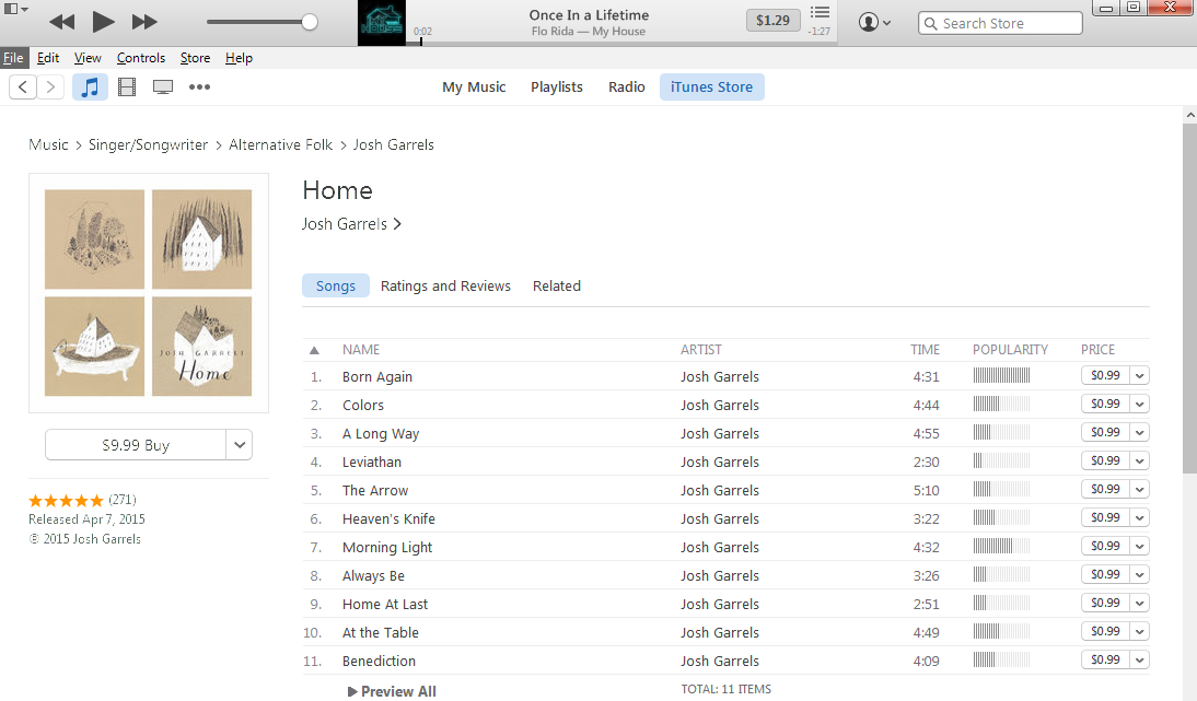
iTuens 12 has adopted new design in terms of toolbar. Toolbar in the middle has migrated to the left. In iTunes 11, tool menus site on the upper-left, upper-middle, and upper-right. The Ones related to device mainly gather in the middle of the menu. While in iTunes 12, main function menu locates at the upper-left corner. You may notice that iTunes Store is extracted from the menu. You can click it and then some related settings will occur.
Switching Media Types
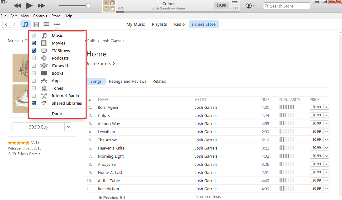
Now you can switch media types at will. iTunes 12 allows you to show or hide icons of music, movies, podcast, TV shows, and etc. Click More(three dots) and then customize it. Tick and select whichever one then it will pop up on the menu. Otherwise, you can hide it. Owing to this, you can easier access wherever you want to go with only a click. With the same controls, it is available to switch media types whether you're browsing the iTunes Store or library.
Mini Player
Mini player also highlights iTunes 12, featuring it as an exceedingly dedicated player. The skin of iTunes 12 mini play is white. When it comes to iTunes 12, player controls are integrated on the progress bar. To change it into mini mode, you just need to click the album cover and the icon on the upper-left corner to restore it.

Recently Added
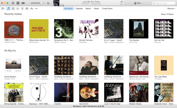
iTunes has put a new function Recently Added at the upper-right so that you can find something new to play. Frequency Recently Added updates can be customized in the view pop-up menu. Options are This Month, Last 3 Months, Last 6 Months, and Last Year. You can uncheck the box next to Show Recently Added and turn it off completely. Recently Added, which helps you quickly search and play media, is exactly handy.
Get Info
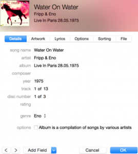
Get Info has been redesigned. To view more info about an item, choose it and then File>Get Info. Detailed information such as song title, music track and some related contents has been transferred to the right side. If you'd like to add a field that isn't visible, click Add Field in the lower-left corner of the Get Info interface. You can choose additional fields and set fields you'd like to always show. In iTunes 12, Get Info opens on the Details tab, and information about the file can be found on the File tab.
Do you agree that iTunes 12 delivers performance improvement compared with iTunes 11? And have you been familiar with the operation of it now? Failing that, just leave your messages and let us know.


